Cécile Undreiner
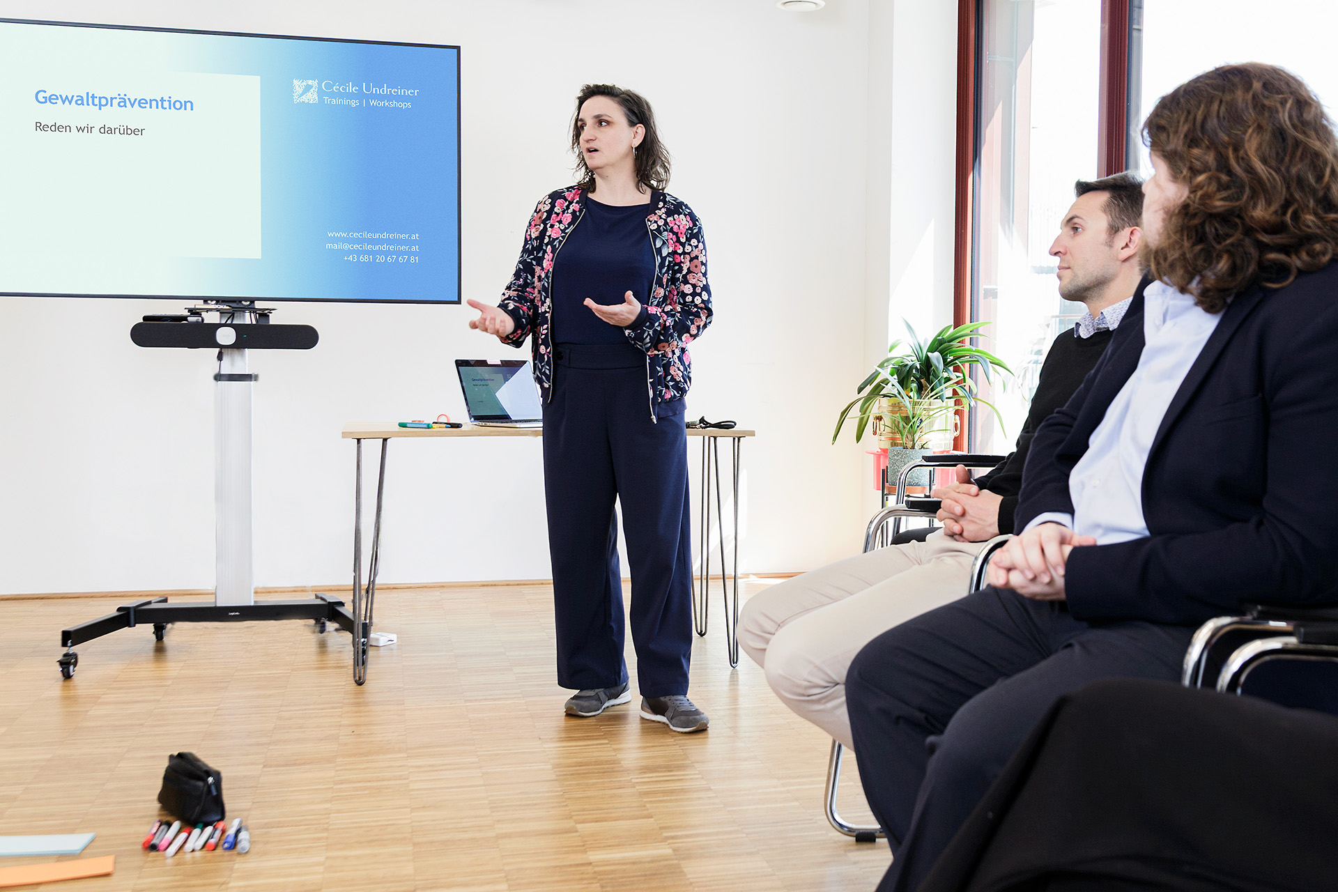
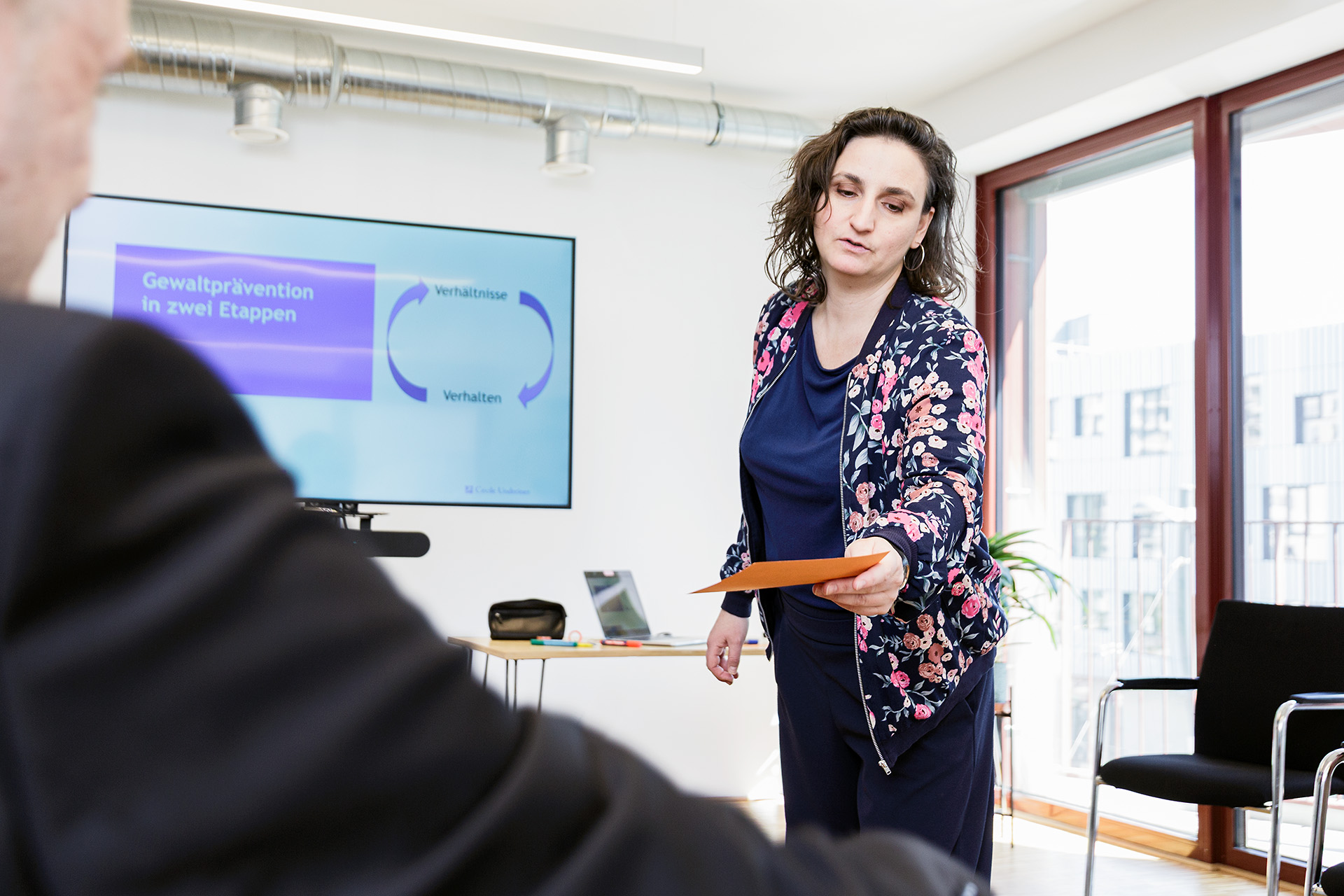
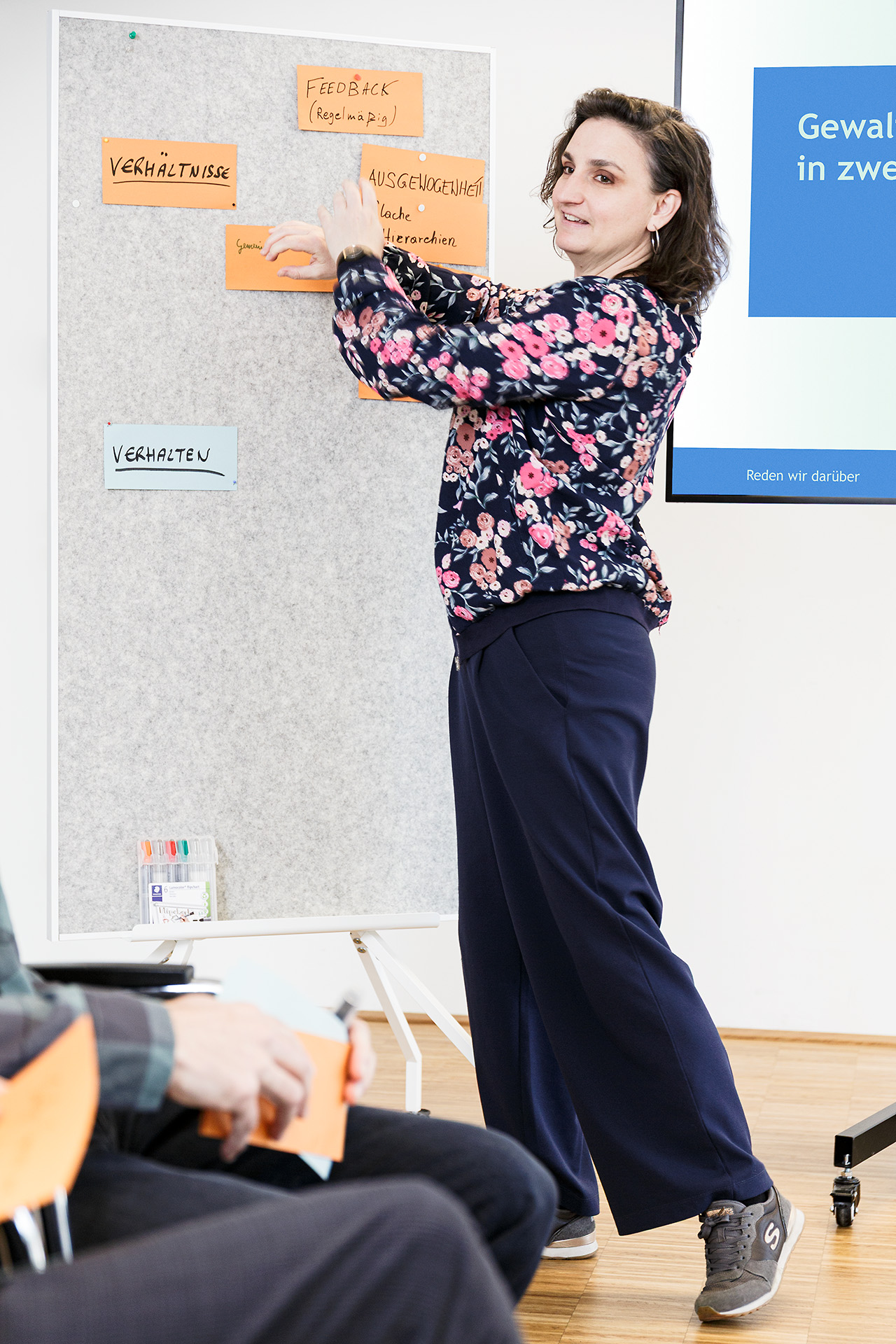
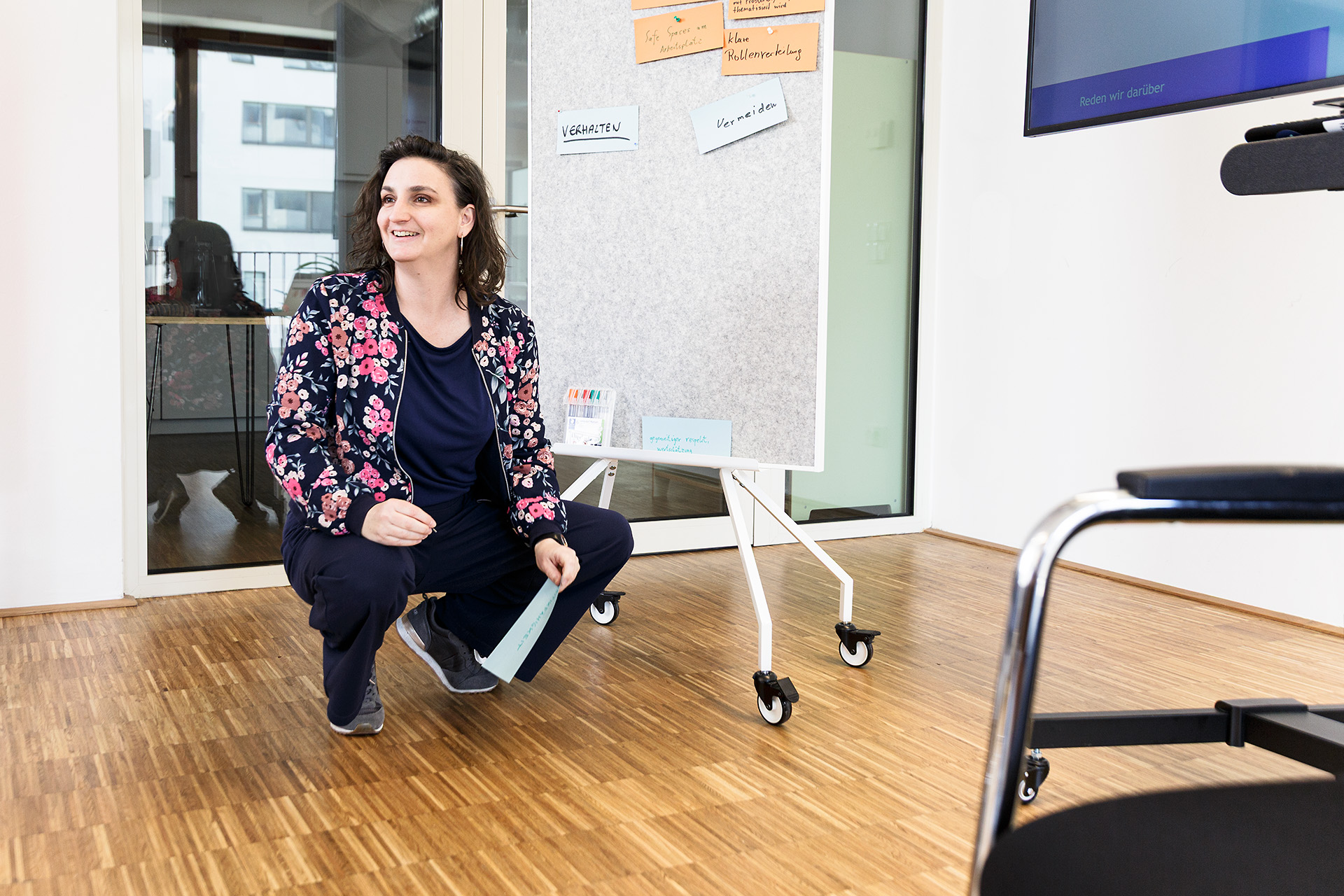
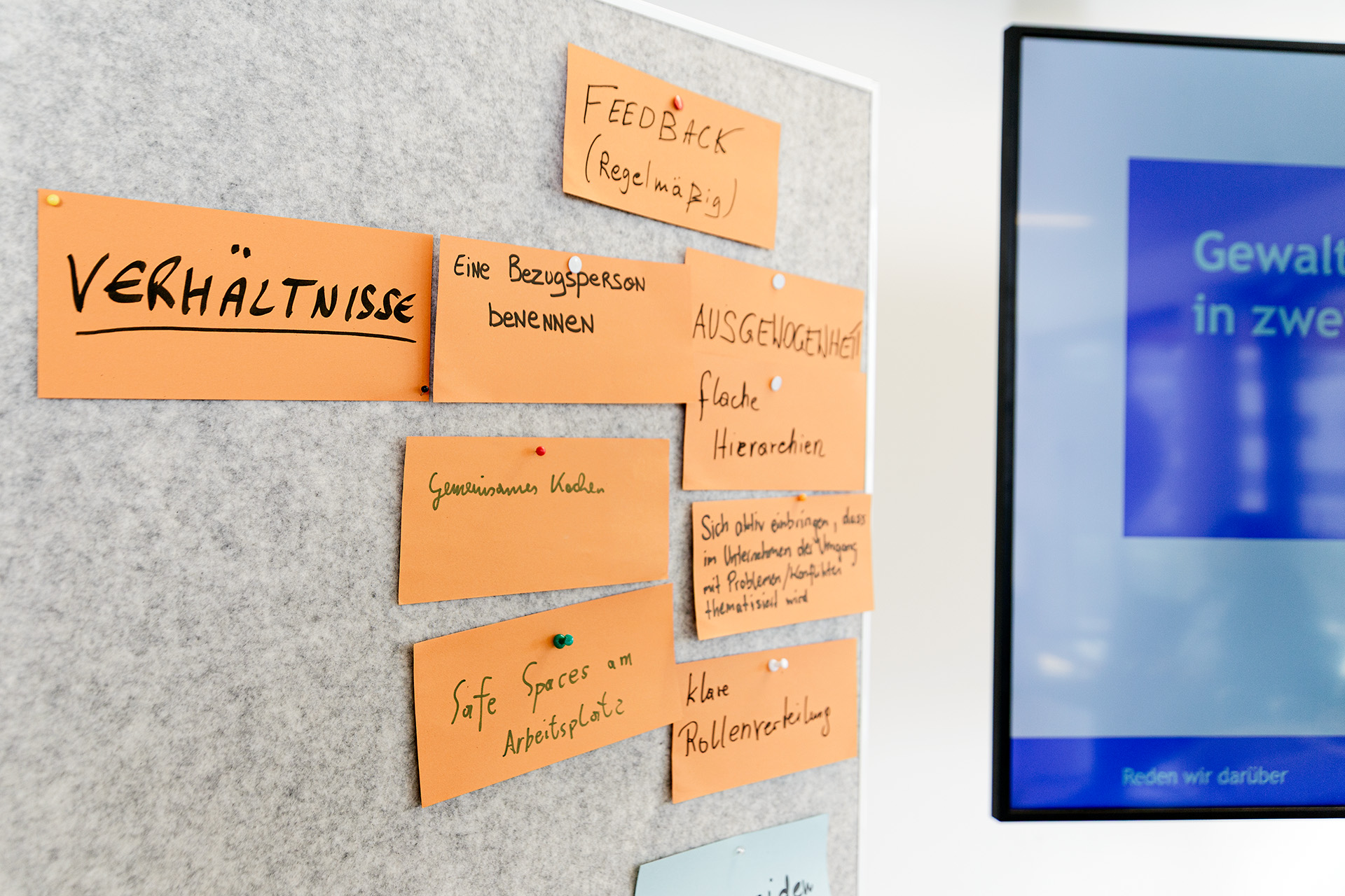
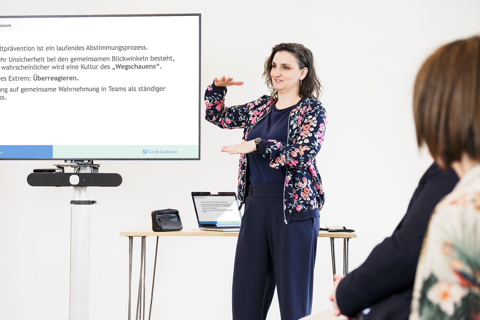
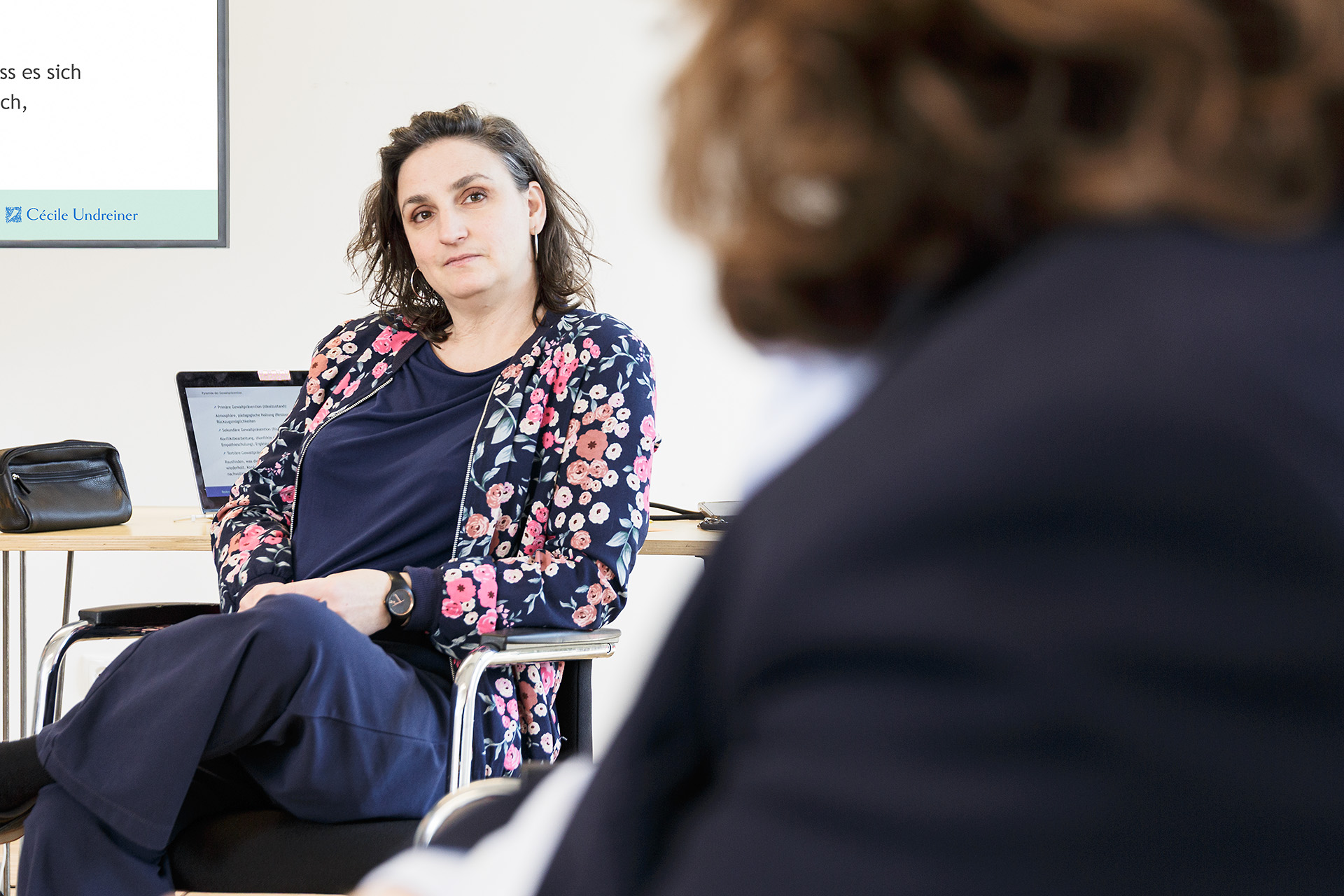
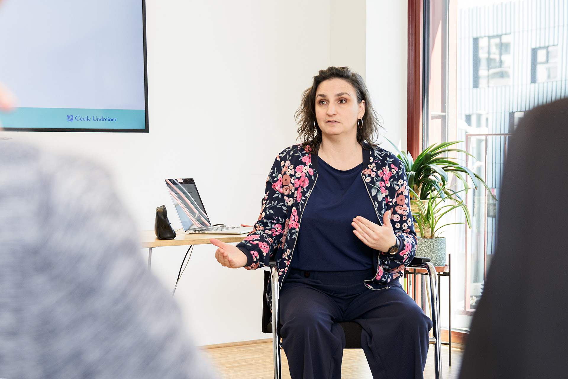
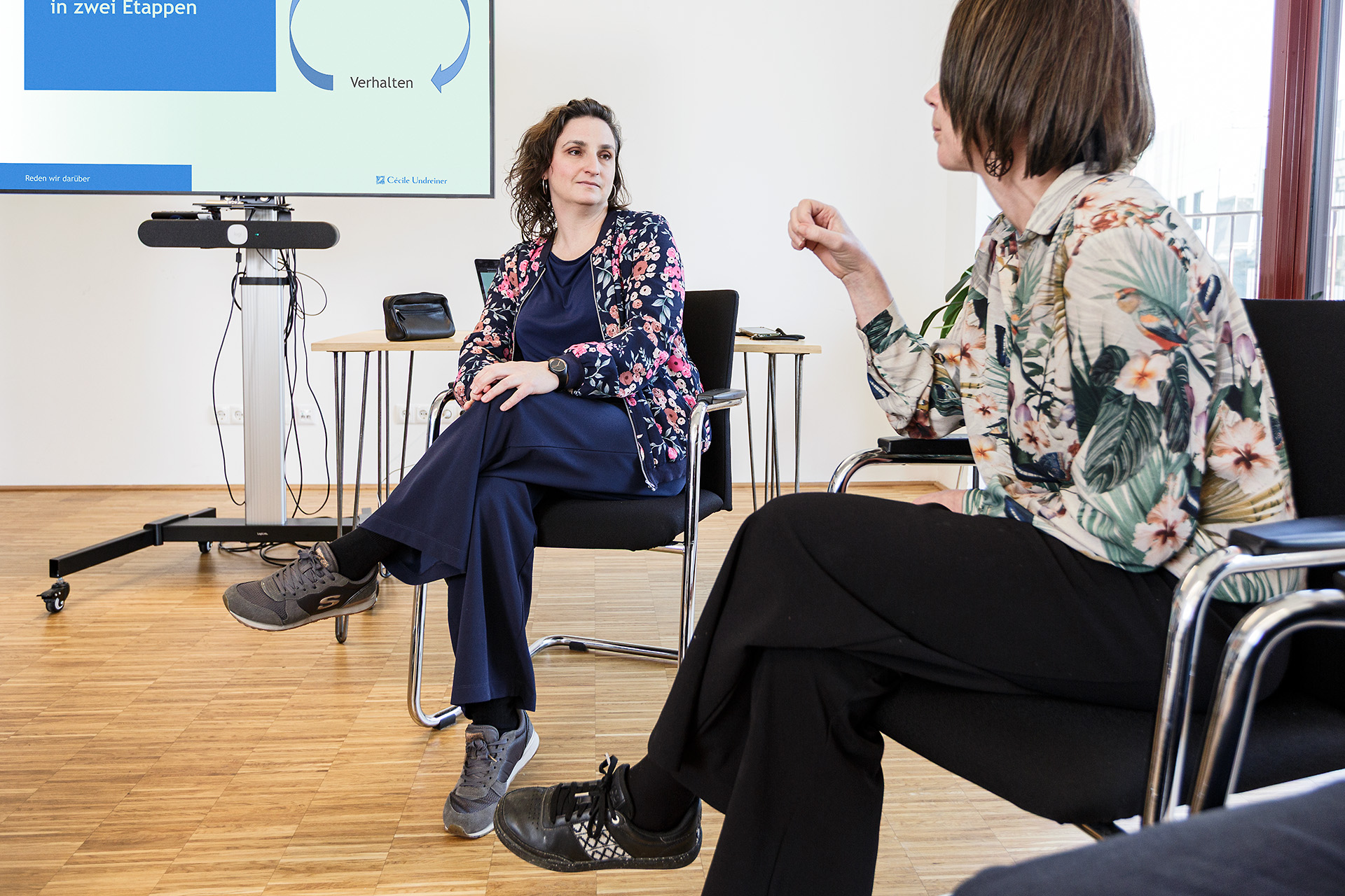
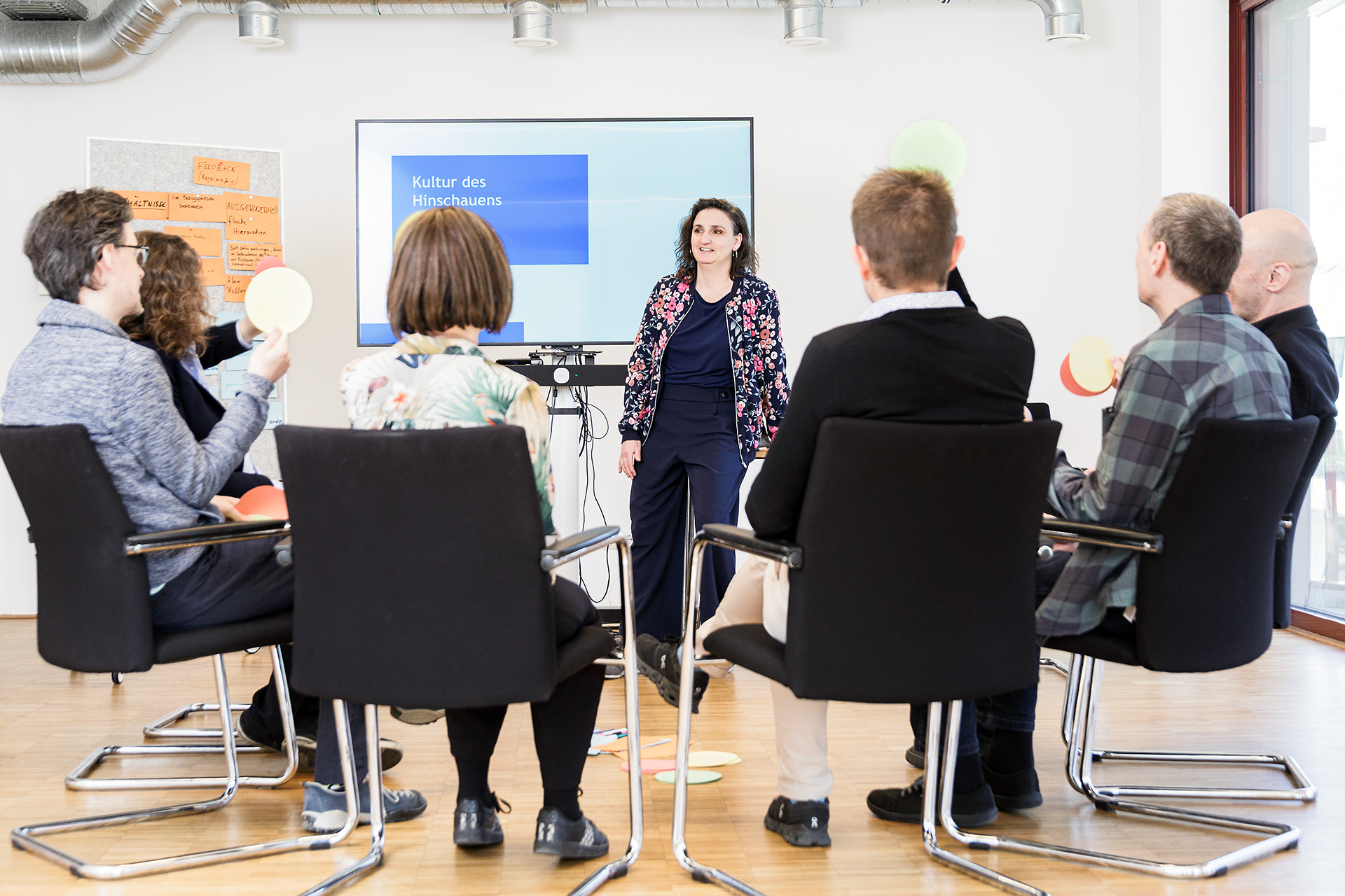
The key element of Cécile's work is language. As a trainer she encourages her clients to talk about topics, which are barely talked about and can be emotionally overwhelming. She is an expert in interpersonal concflict management and in the prevention of violence.
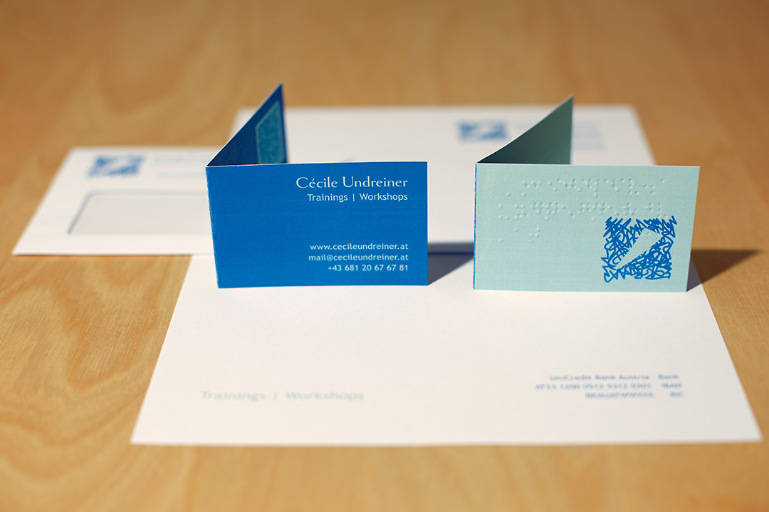
The corporate design for Cécile is serious, yet playful. The darker blue as corporate colour invitates to non-confrontative communication. Wheres the mint hue represents growth and development.
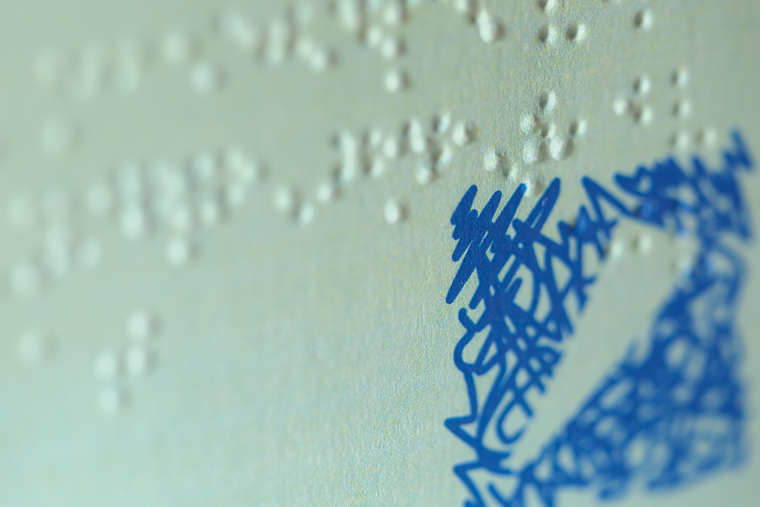
The logo design combines a graphic element, representing a safe space witin the chaotic simultaneity of thoughts and feelings, with a friendly, yet serious, serif typeface. In addition, her business card explicitly includes the visually impaired by means of braille.
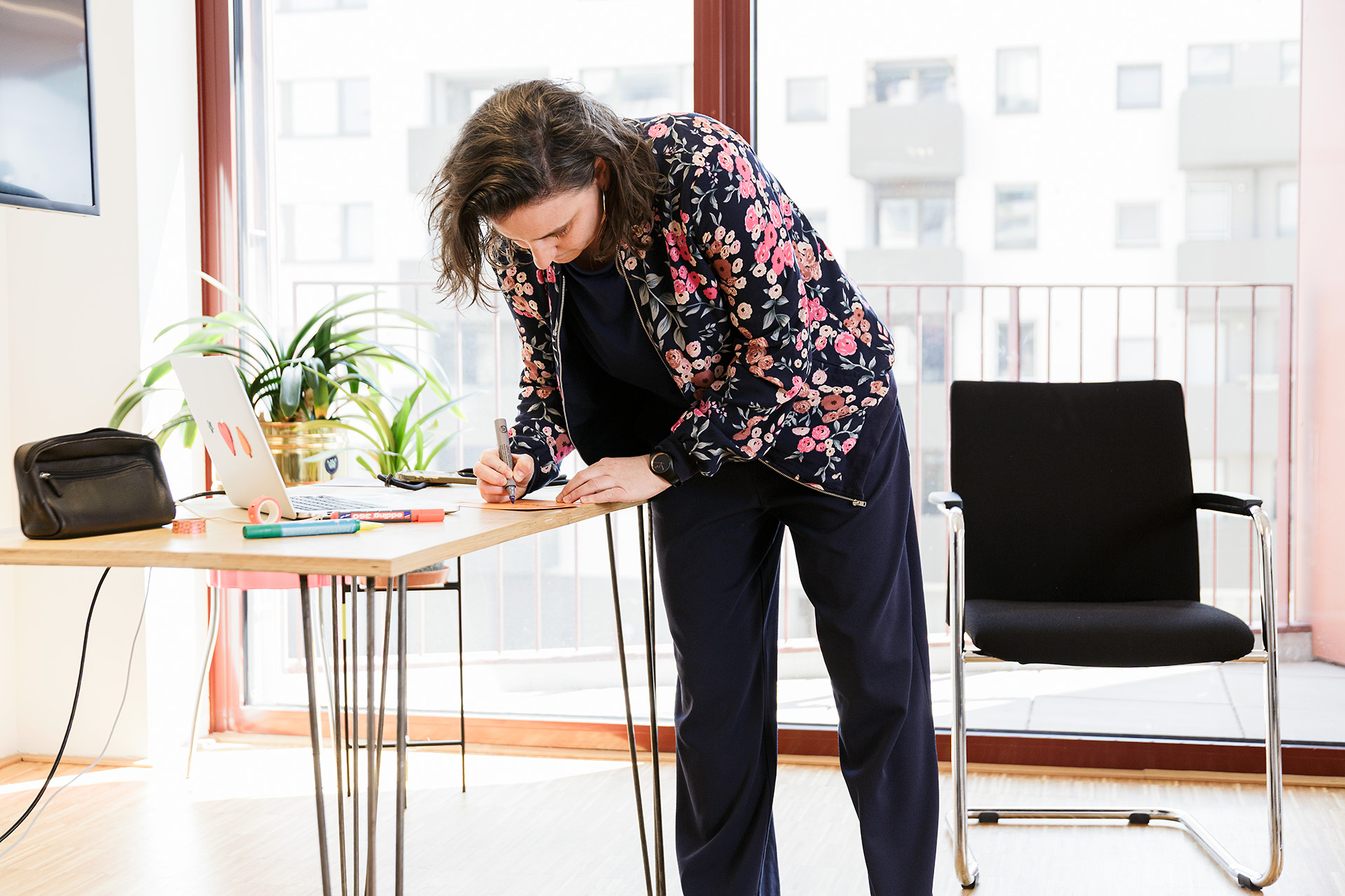
I would kindly and specifically like to thank die HausWirtschaft for providing the perfect infrastructure for the workshop fotoshoot.